Championing a Challenger
at CONEXPO-CON/AGG
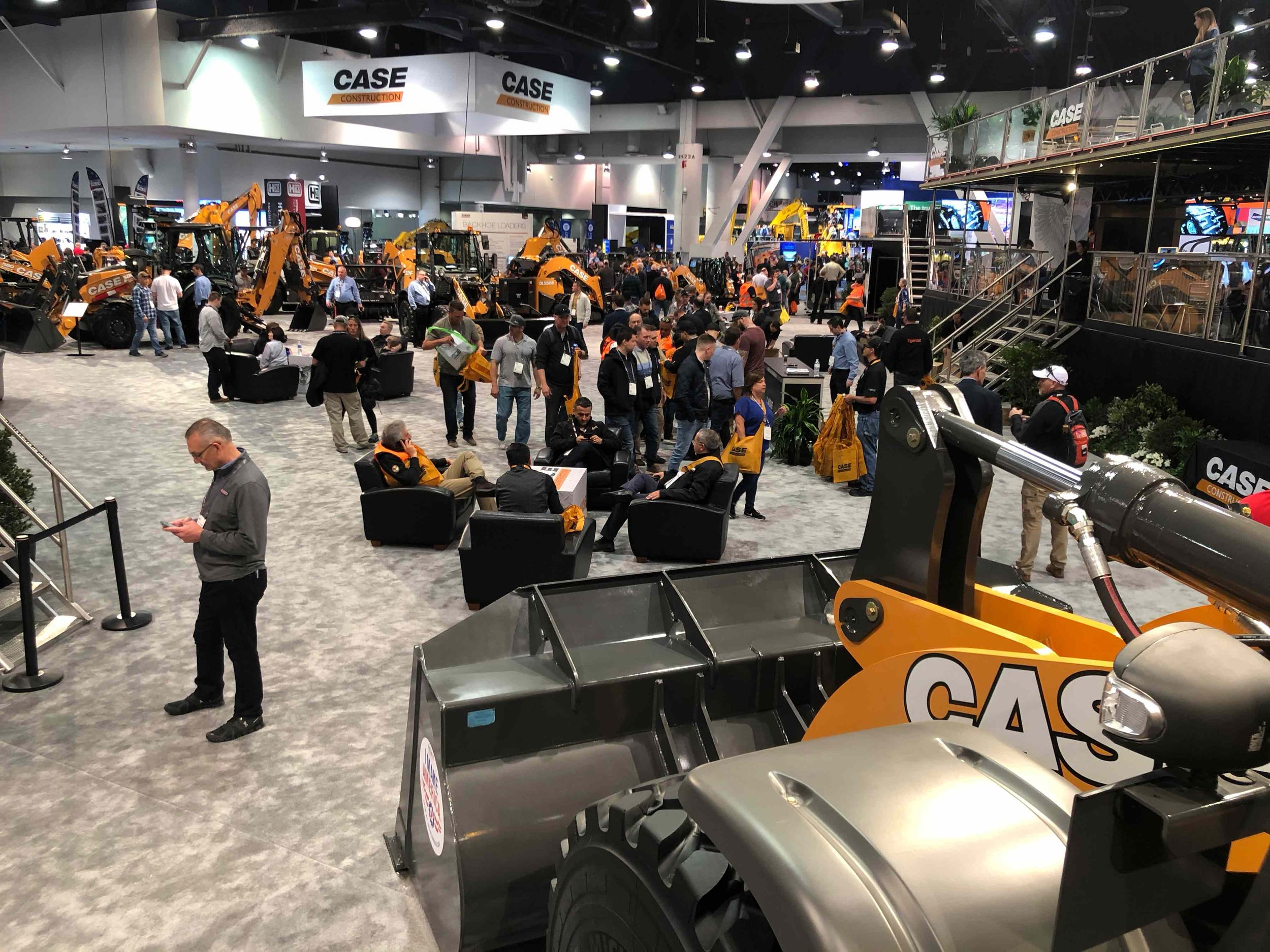
CONEXPO-CON/AGG is North America’s largest construction industry trade show. It takes place every three years in Las Vegas, NV and draws attendees from all over the world. Like all manufacturers, CASE wanted to differentiate itself but needed to do so on a challenger’s budget. We were given the freedom to stretch the brand and decided to leverage CASE’s purpose — building communities — as our focal point since most competitors were still leading with equipment and specs. While my team worked on various ideas and creative, I developed and/or designed the following concepts.
Saying More with Less
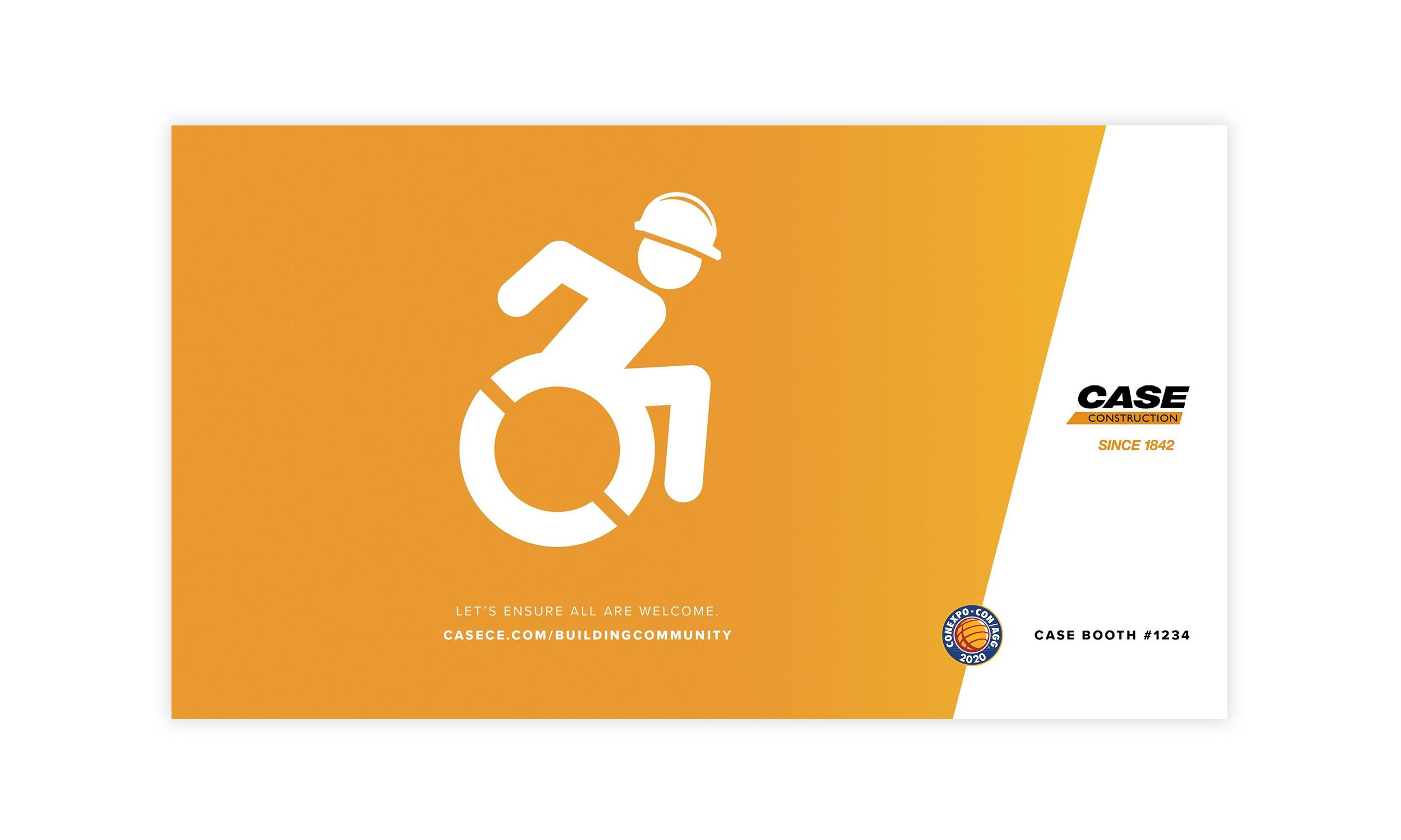
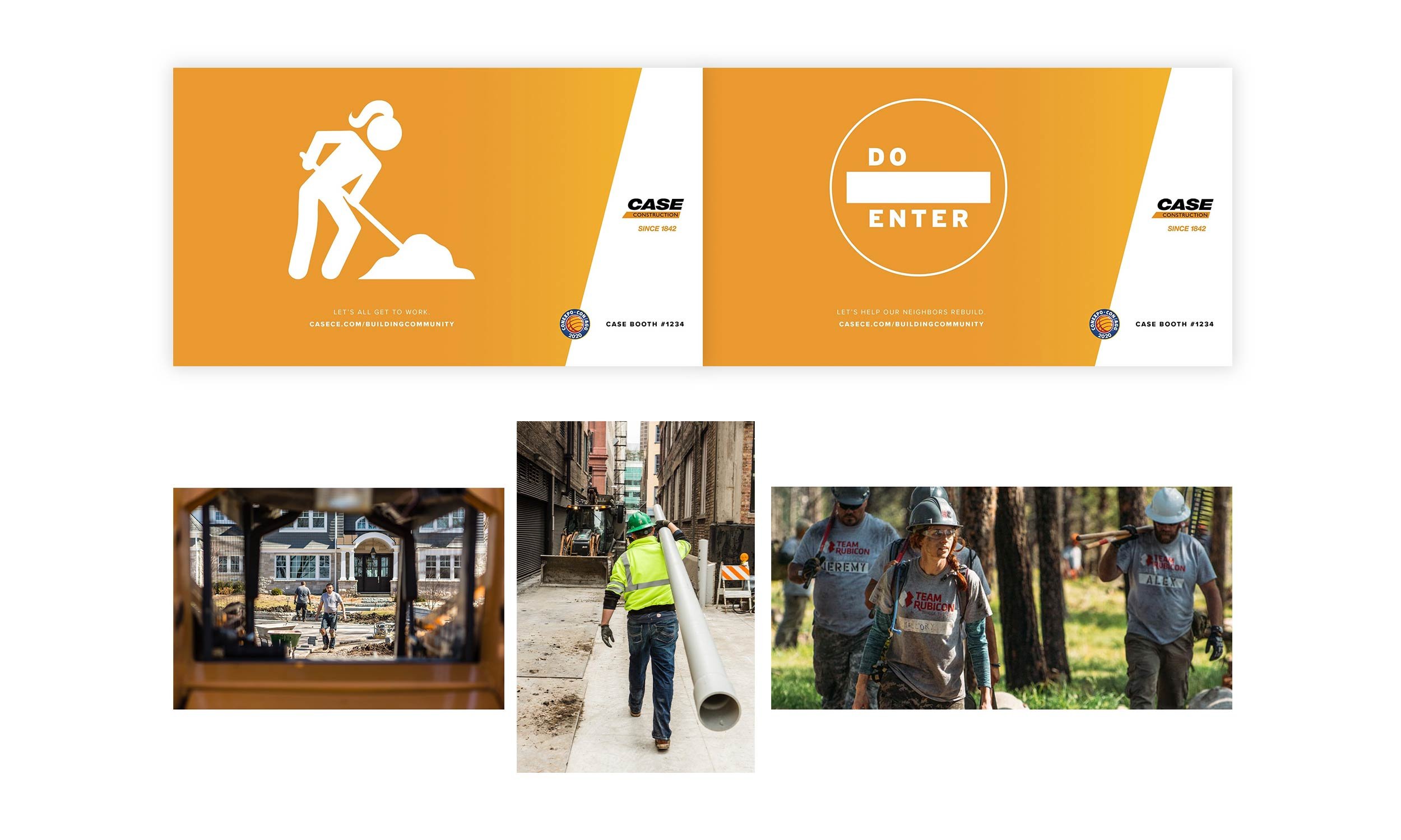
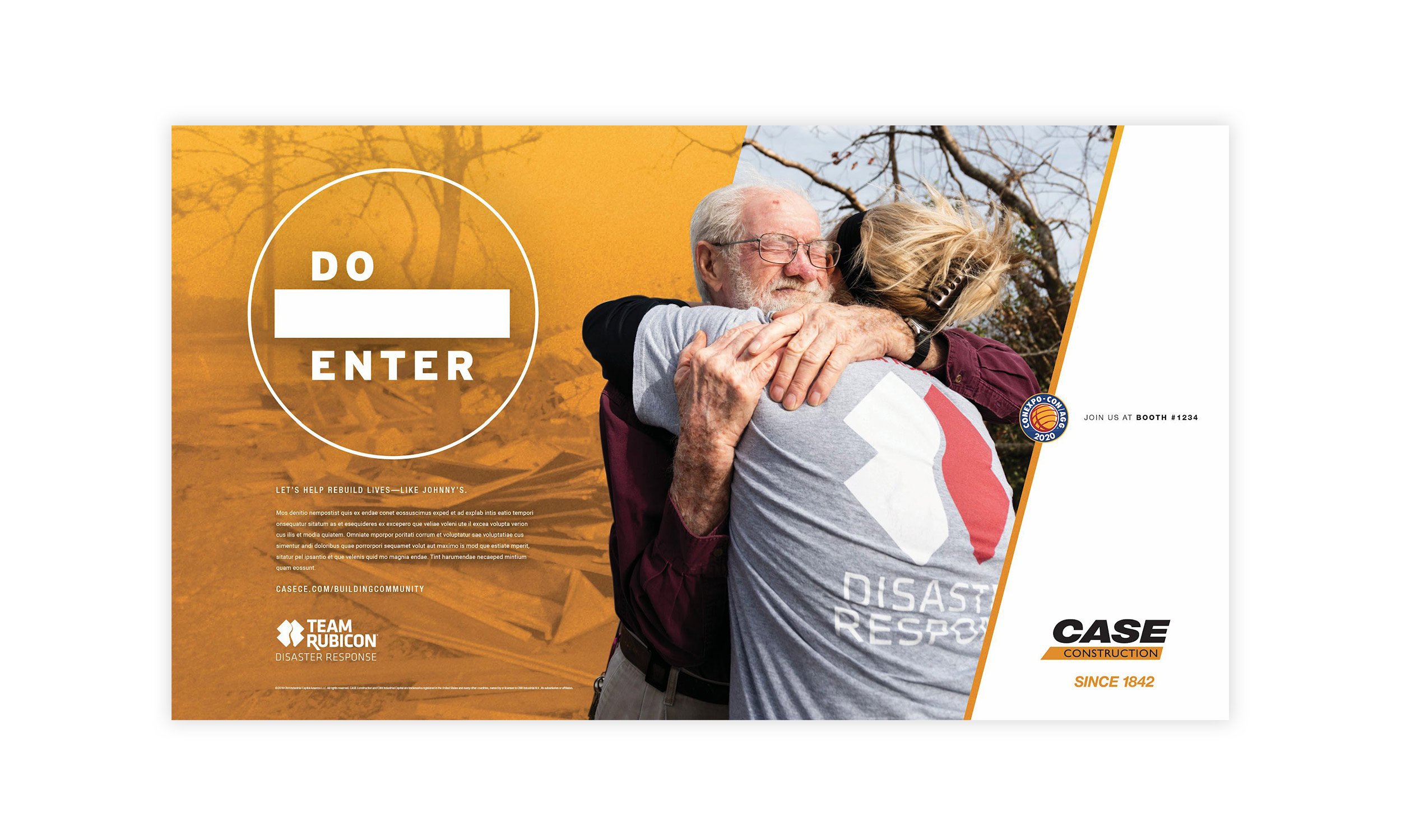
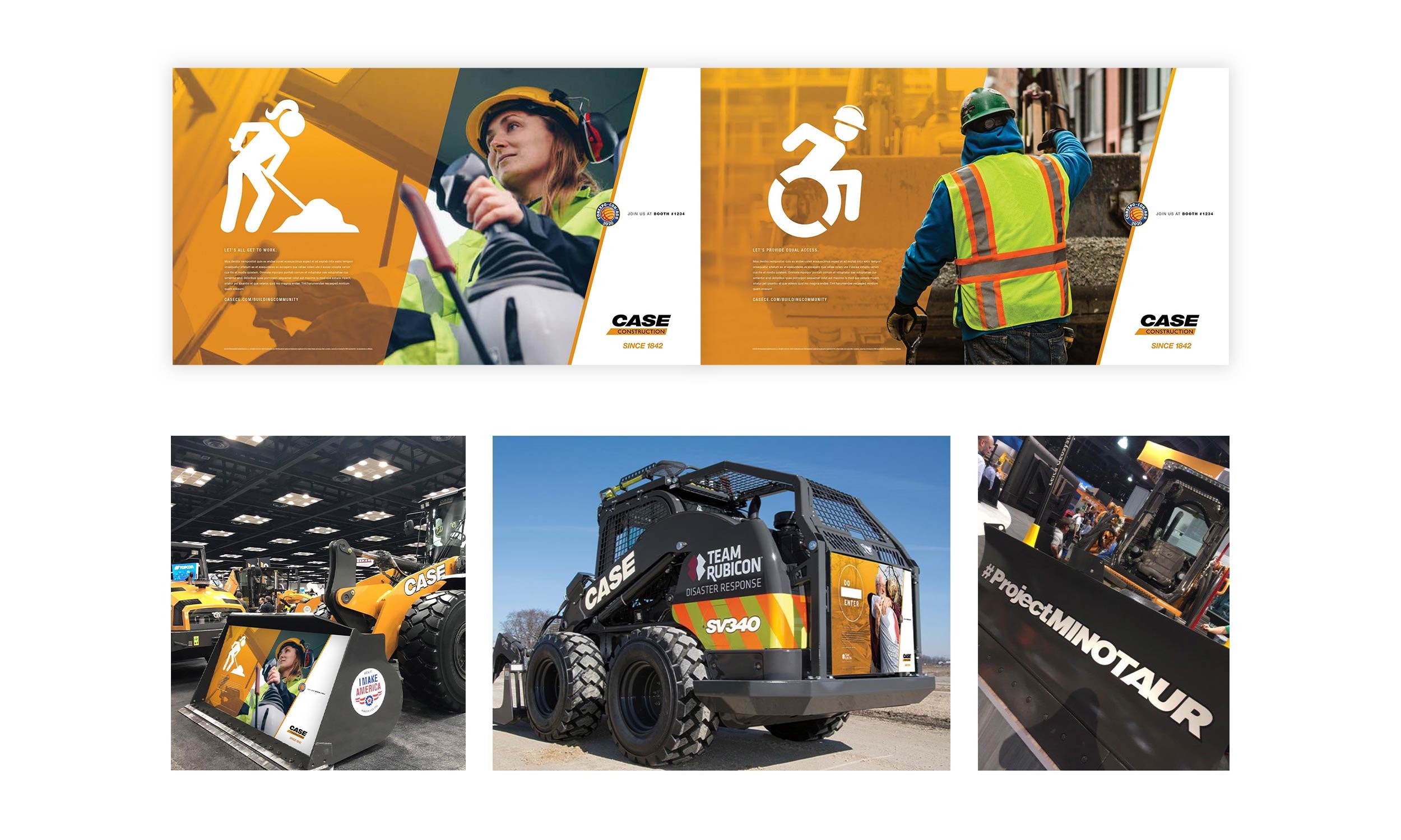
Though CASE’s purpose is building communities, I lobbied that CASE also builds community and that this higher-level message was worth touting. Plus, I could pay off that statement based on some elements I knew were intended for their booth, like:
A wheelchair-accessible concept machine
Highlighting CASE’s partnership with Team Rubicon, a veteran-run disaster relief organization
Greater acknowledgement of female owners and operators
CASE was also making strides toward creating more intuitive experiences, and that was also a message they wanted to communicate. That said, I wanted at least one concept to be very clean and streamlined as a nod to CASE’s intuitive aspirations.
This led me to the idea of taking ubiquitous industry icons and giving them an unexpected twist. Aside from their simplicity and immediate recognition, icons would offer flexibility to create the visuals we needed since photoshoots were not an option and existing imagery didn’t always work. Plus, the clean layout, human message, and use of icons would stand apart in any industry publication.
I created the following ads as well as the copy. To get ahead of potential comments that icons could feel cold, I created a second version that incorporated imagery. I had a specific style in mind, one that captured people absorbed in the moment to provide added emotion and authenticity.
Lastly, I also included a few zero-footprint ideas to minimize the need for additional structures in the booth to further the idea of simplicity.
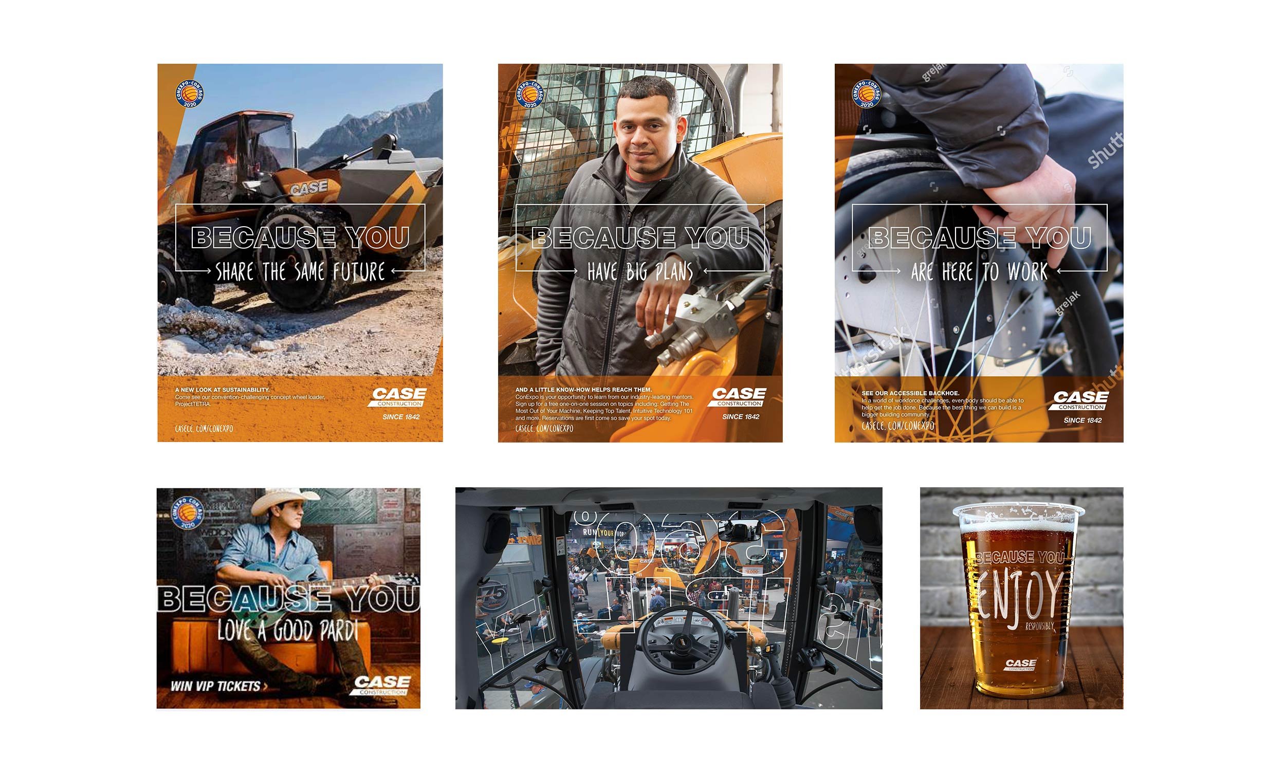
Leading with the Customer
Another teammate developed the mechanism “BECAUSE YOU [fill in the blank]” as a way of directly addressing our audience and acknowledging the various reasons they attend the show. It also provided a means to align those reasons or needs to solutions CASE would feature at their booth. And, the “YOU” allowed us to tailor messaging to the various audiences that attend the show (e.g., C-suite, owners, operators, fleet managers, contractors, etc.).
To help keep the focus of the customer and their wants and needs at the forefront, I explored outlined type so the maximum amount of image could be seen and I planned to pair it with actual handwriting of each subsequent phrase to provide a more human touch.
I designed the following ads and also developed some of the subheads and copy. To show that the treatment could have legs, I applied it to other applications in the booth and especially appreciated its use on machine windshields to highlight features without impeding visibility when attendees were inside the cabs.
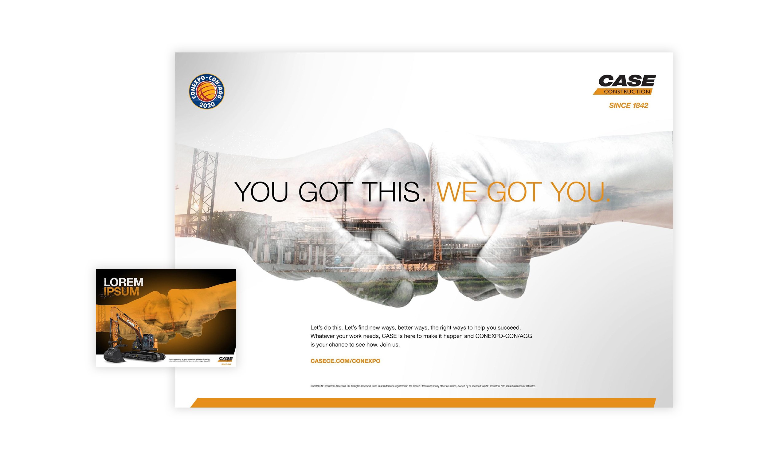
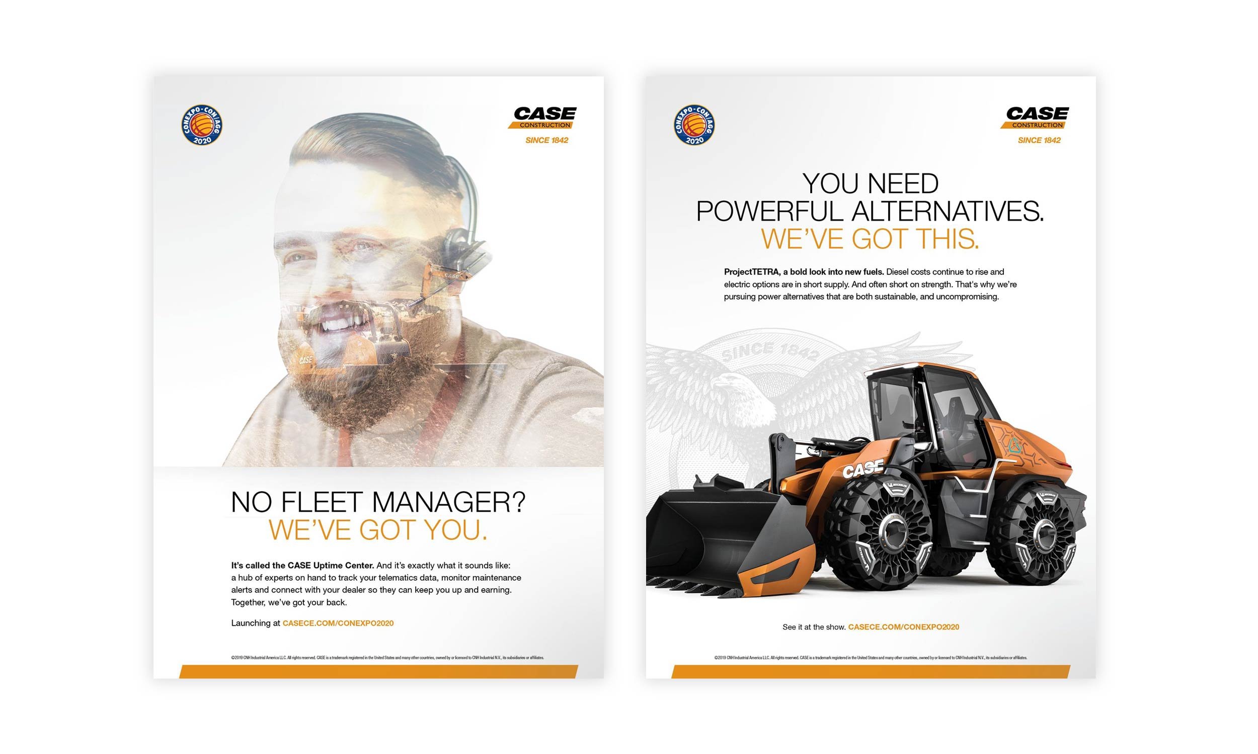
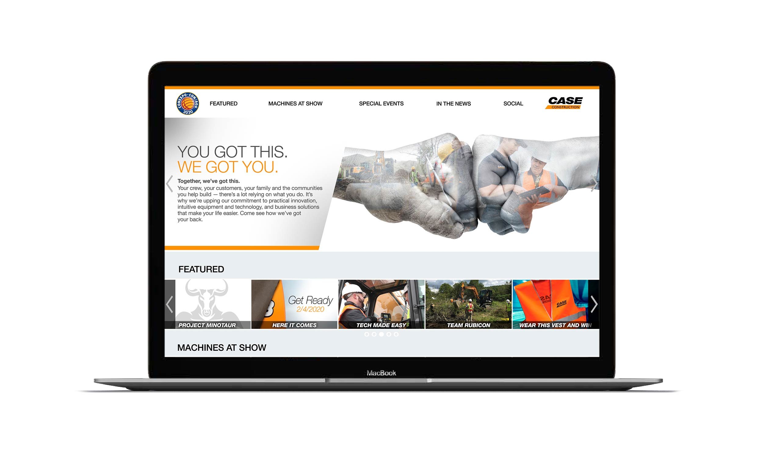
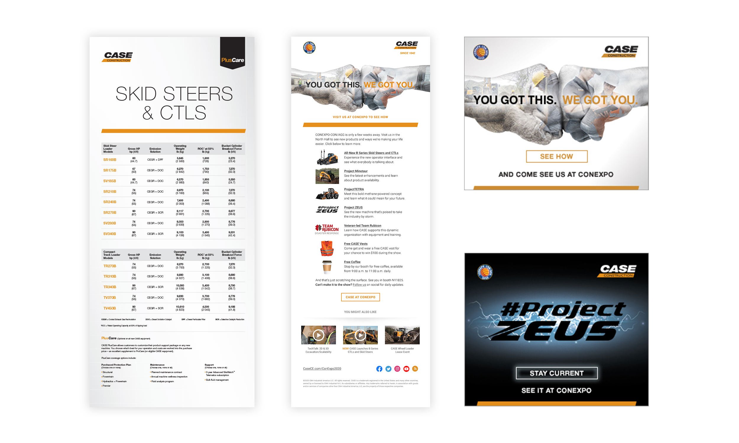
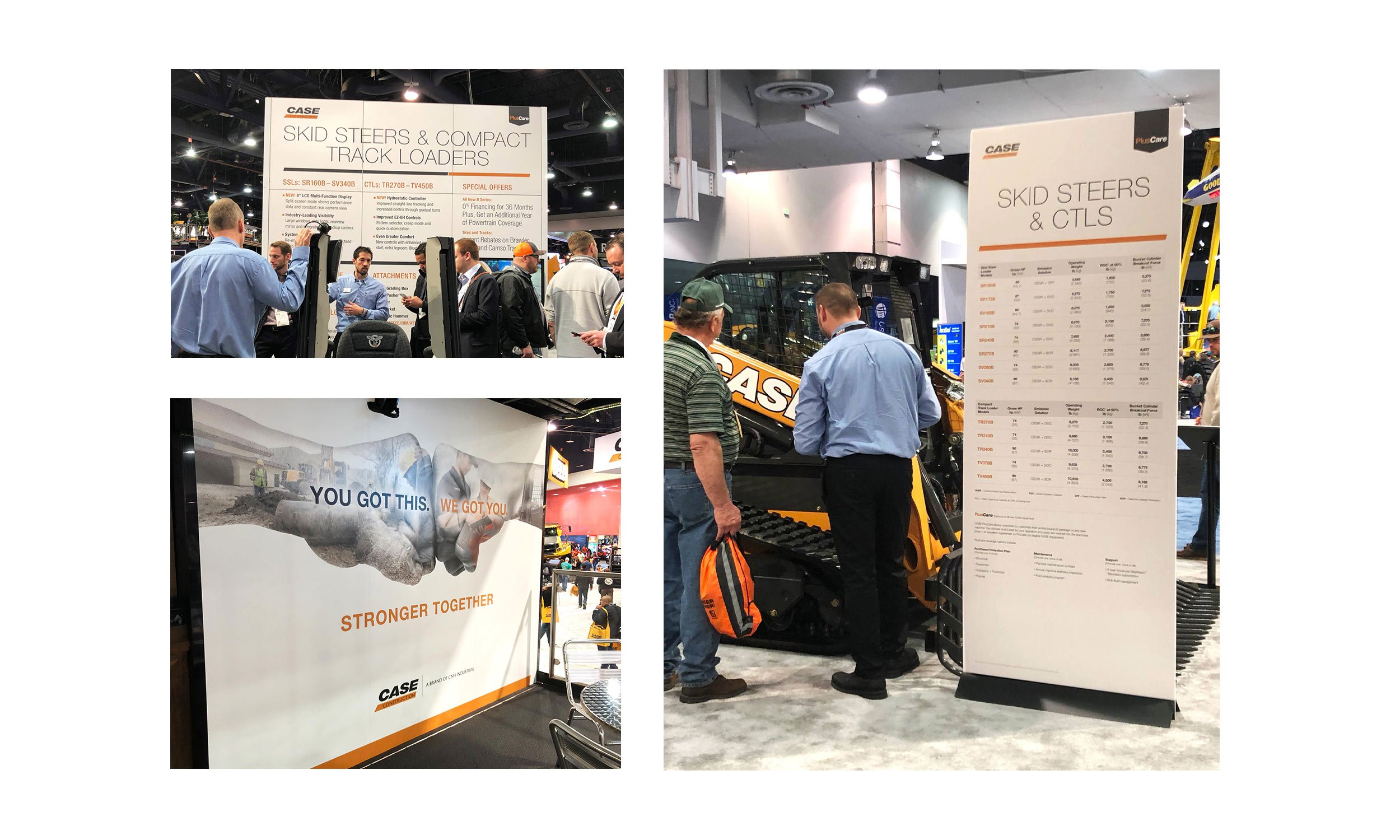
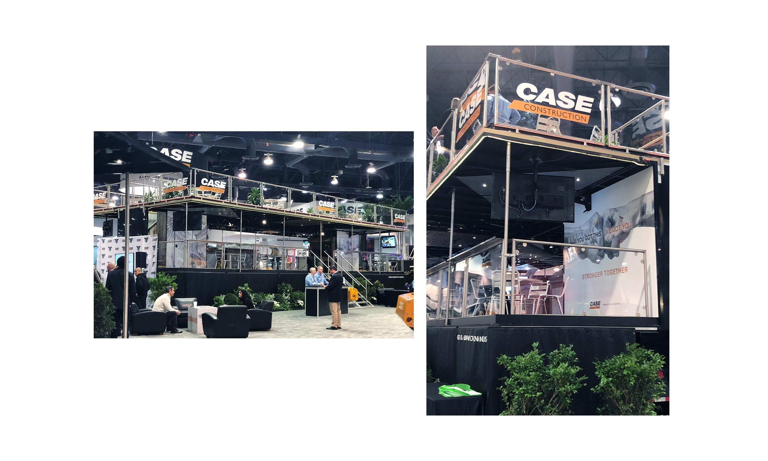
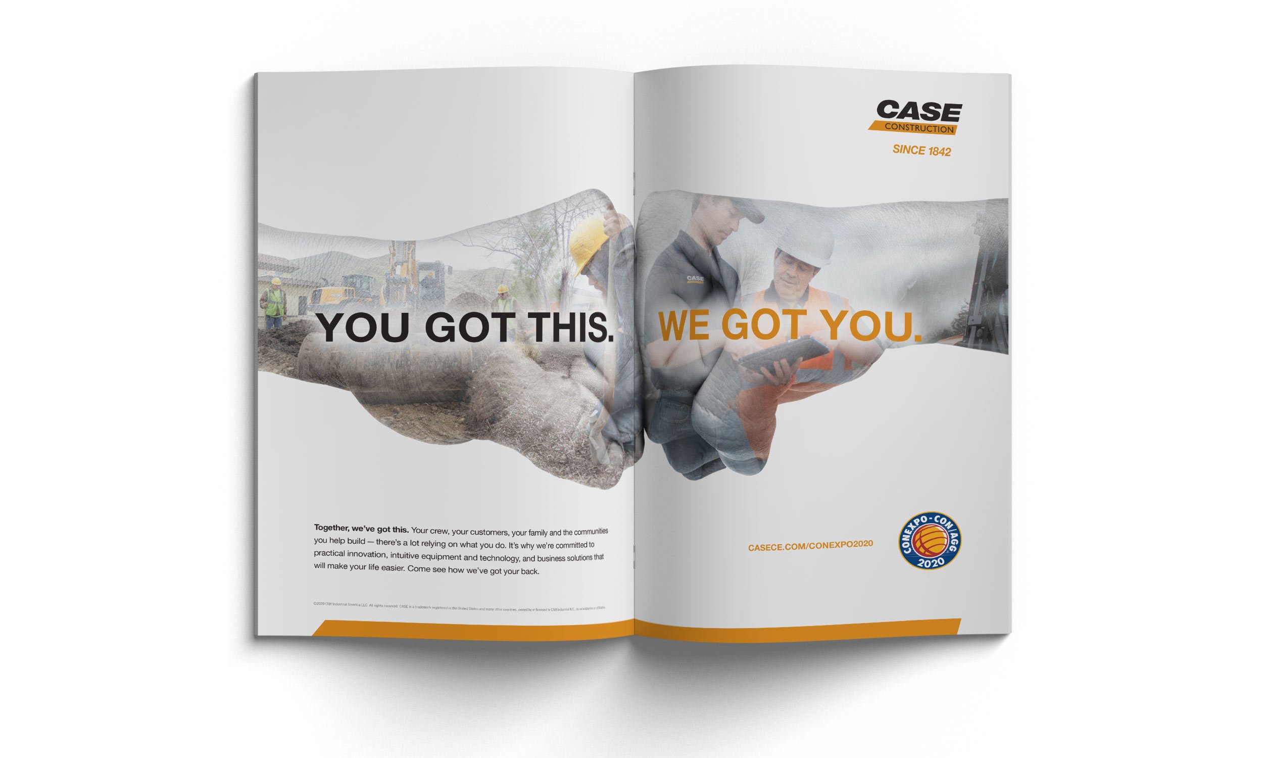
We Got You.
The team developed an approach that was conversational, empowering, and positioned CASE as the partner always there to help, no matter the need: YOU GOT THIS. WE GOT YOU.
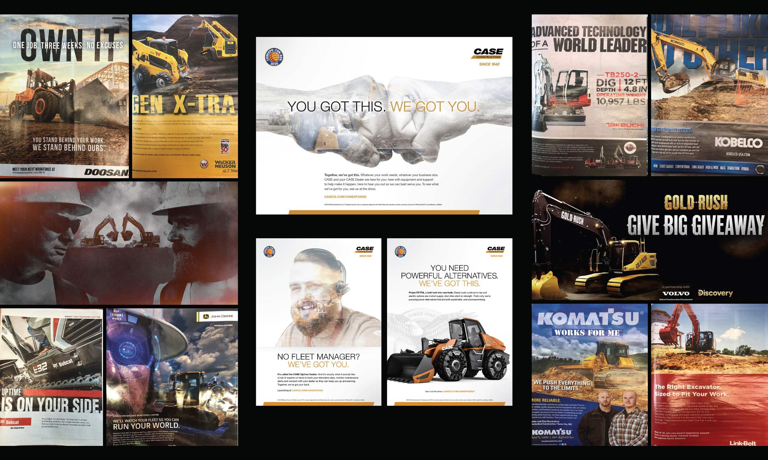
I paired that line with a fist bump image lifted from another internal concept and appreciated that the self-contained image within an image allowed for more white space — my industry reconnaissance showed that a cleaner, brighter layout would stand out among the gritty, busy ads the competition was running. I also explored other ways of simplifying full-bleed imagery to minimize distraction.
To preserve but evolve a main branding component, I took CASE’s “Power Bar” — a thick orange stripe that was typically used to contain body copy — and transformed it into a sleek design element to serve as a consistent footer. Lastly, I moved the brand logo up from the bottom right to the upper right for more visibility and better balance when paired with other logos.
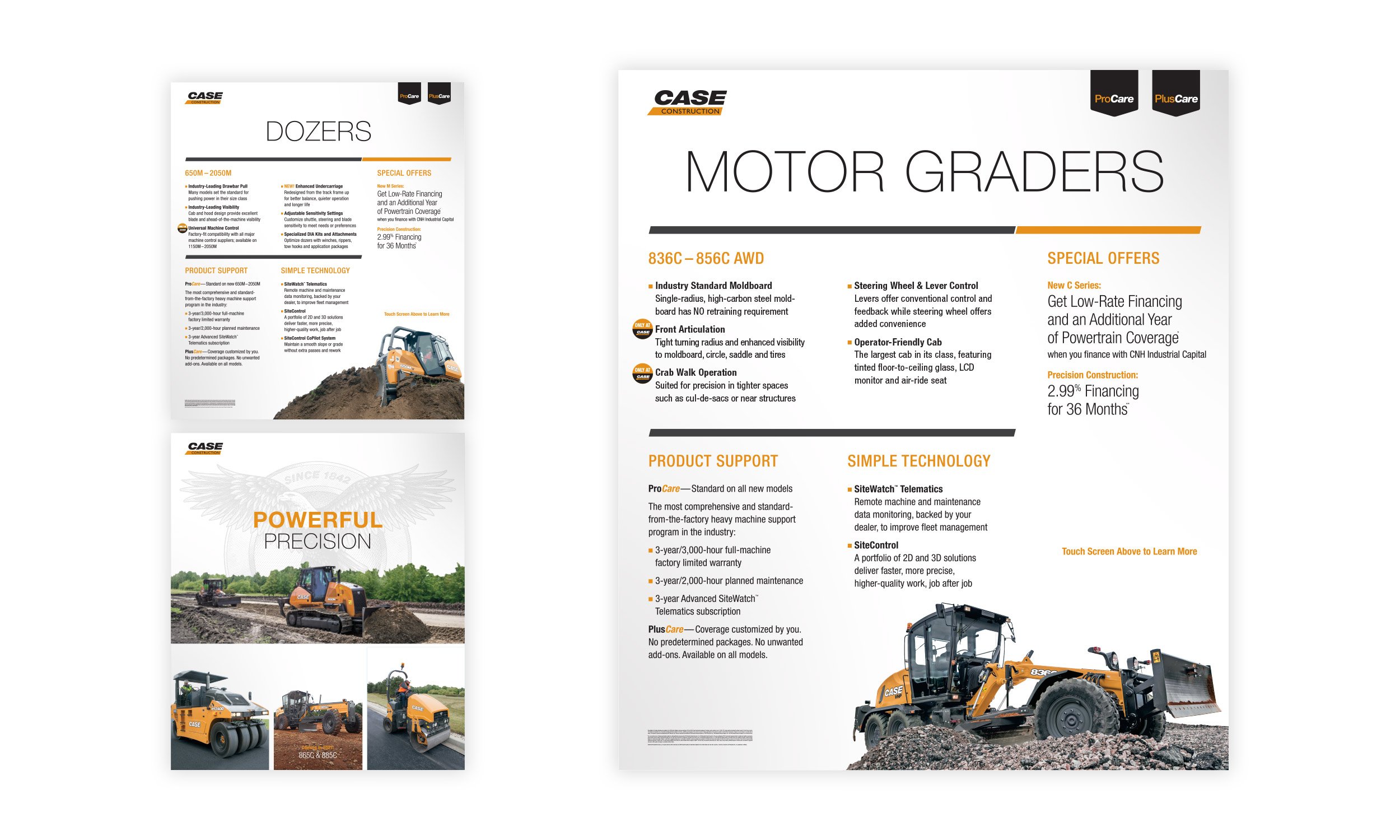
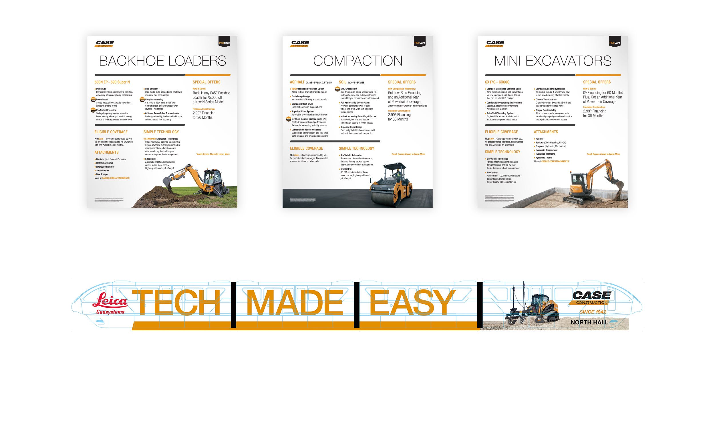
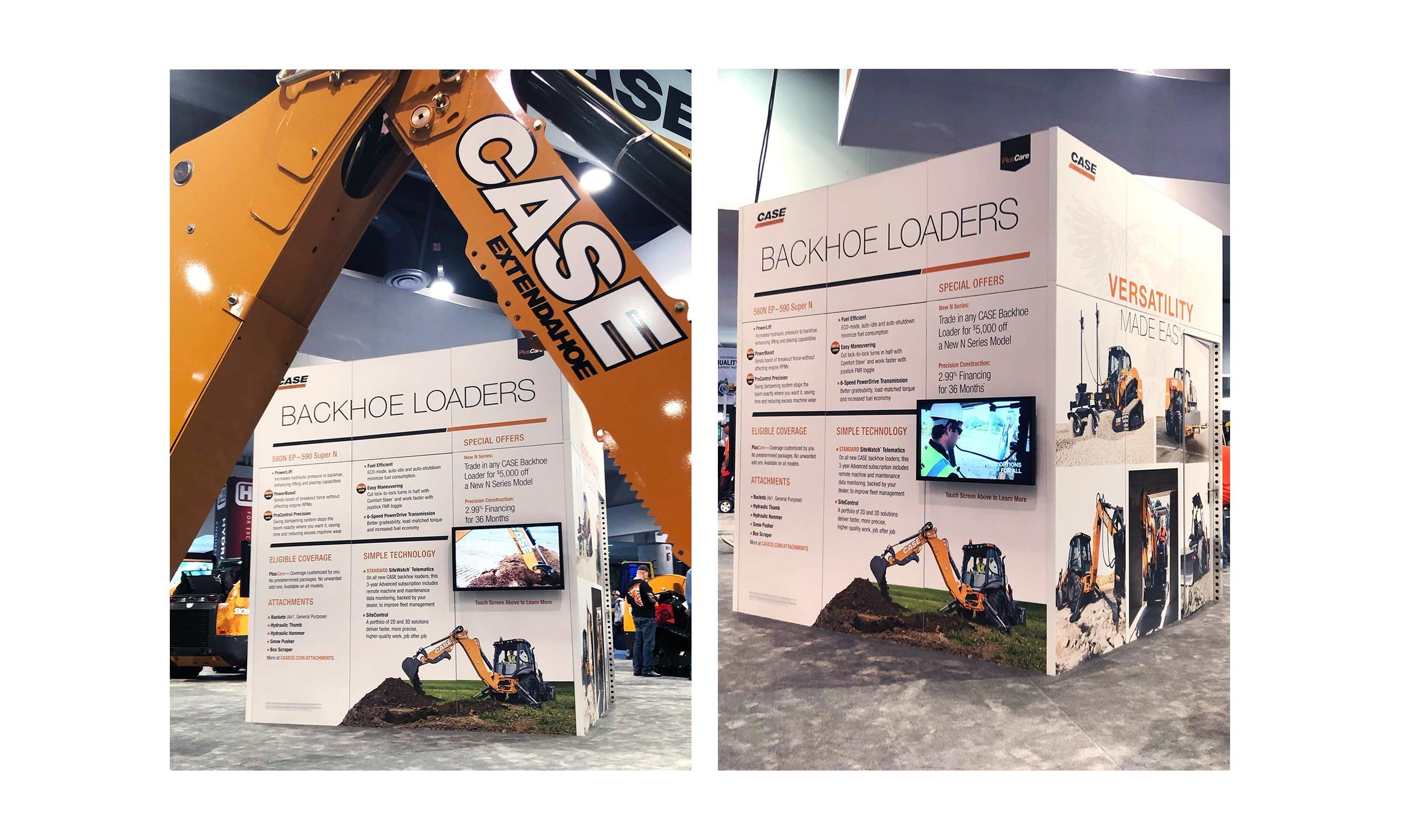
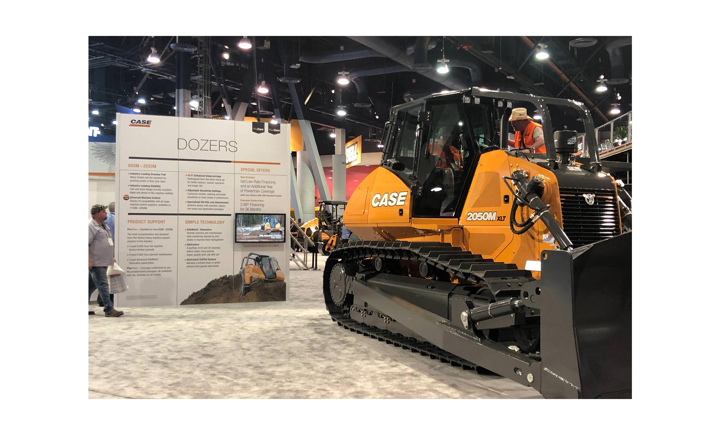
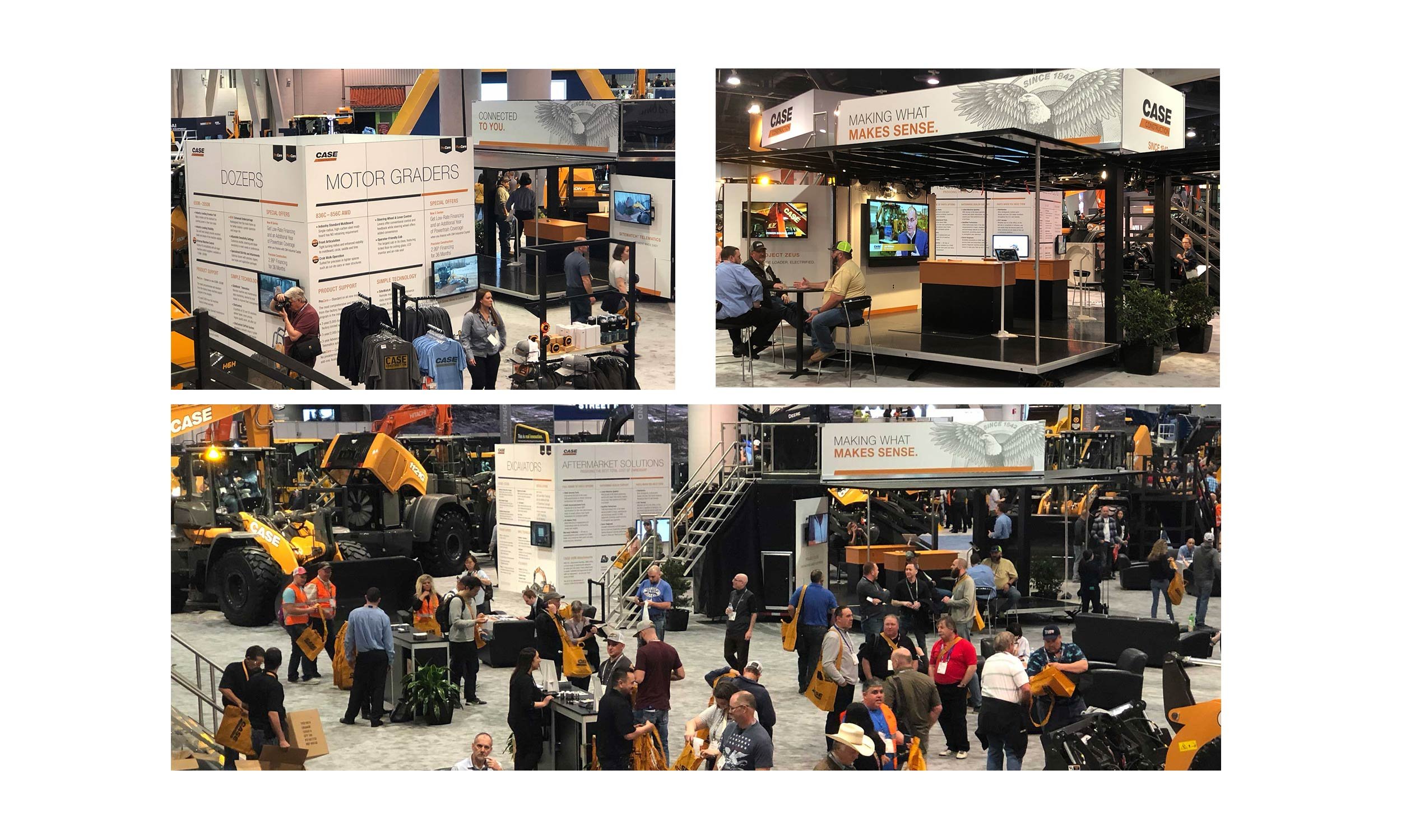
I successfully adapted this clean, straightforward, and streamlined approach to booth signage and large kiosks that were packed with information and imagery.
The Director of Marketing for CASE North America, our client, was involved throughout this process and sought prior buy-in from Global before approving this evolved look. It was so well received that this approach ultimately became CASE’s latest global brand evolution.